You are using an out of date browser. It may not display this or other websites correctly.
You should upgrade or use an alternative browser.
You should upgrade or use an alternative browser.
Feedback: Update to version 2.148
- Thread starter Arci
- Start date
DeletedUser2458
Guest
I don't like the new (adjusted) icons. It's less clear in my opinion. I suggest to try gold icons or reverse the change.
Draba Aspera
Zeus
Could you please provide screenshots (before and after)? I´m not quite sure what has been changed since I don´t have the respective icons/effects available at the moment.
I noticed that the quest log icon has been changed, though. It´s still ugly but in another colour...^^
I noticed that the quest log icon has been changed, though. It´s still ugly but in another colour...^^
galanoulis
Zeus
I noticed that the quest log icon has been changed, though. It´s still ugly but in another colour...^^
I think you are wrong on this one..... it is not still ugly.....in another color....
It is uglier than ugly...... That light blue color is the worst choice ever... remind me of those colors used on the first website back in 90's......
Instead of been distinctive, my eyes can not get out of that corner and this is really annoying....
Draba Aspera
Zeus
Before and after
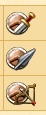
Ah, those defense icons! The wording in the changelog was not clear...
I don´t know what was wrong with the old defense icons. You certainly need not to be colour-blind to have issues understanding what is meant here, and the change in 2.148 does not change the fact that those icons are not self-explanatory and can barely be "read" and understood. I had to explain several times that the "round thing" is not a globe but is supposed to be some kind of shield - and now after the change the "defense against distance weapons" icon looks more than ever like an old globe on its rack...^^
I think you are wrong on this one..... it is not still ugly.....in another color....
It is uglier than ugly...... That light blue color is the worst choice ever... remind me of those colors used on the first website back in 90's......
Instead of been distinctive, my eyes can not get out of that corner and this is really annoying....
Okay, I didn´t want to be rude for a change (^^), but I completely agree. The quest log icon has always been ugly, but it has been ugly in an unobtrusive way. Now you cannot keep your eyes away from its ugliness...
")
Draba Aspera
Zeus
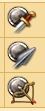
Heroes:
The unit information shows the new defense icons, but when you train/level your hero, you will find the old icons


Btw... Is there any reason why the icon and value for defense against distance weapons is missing in the hero training windows?
The unit information shows the new defense icons, but when you train/level your hero, you will find the old icons
Btw... Is there any reason why the icon and value for defense against distance weapons is missing in the hero training windows?
DeletedUser2458
Guest
It's displayed under attack.
Draba Aspera
Zeus
Well, seems as if I am not used to the old icons any more...^^
Share: