Feedback: Update to version 2.110

DeletedUser2362

Guest
The only problem I can see is that now people won't be able to sneak a CS in and conquer a city. Making conquests/revolts public knowledge will make it a lot harder to hold the city.
 

a-tla-s

Pegasus
Changes are ok, but:

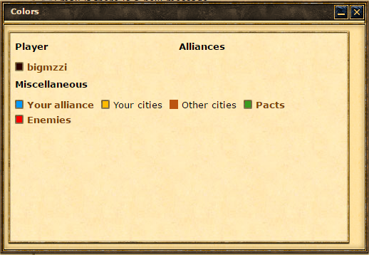
1. Colored spots on the strategic map are too big (and ugly).. Make them smaller by 10-15% (marginally bigger than normal spots)

2. Strategic map is meant to show as much ocean space as possible. Thus, the highlight menu window is an obstacle, even in minimized form at the bottom of the screen. You can (?) embed it (in minimized form) on the top of the screen, between the name of the city and resources.
g1jqtWt.png


Thanks (F)
 

DeletedUser

Guest
The only problem I can see is that now people won't be able to sneak a CS in and conquer a city. Making conquests/revolts public knowledge will make it a lot harder to hold the city.

Hi. No, we don't make conquests/revolts or your attacks public. Only your own cities will get the smoke / fire or the cities you attacked. The smoke / fire is only displayed for you and your opponent. You will not be able to see other players ongoing conquests on the map.
 

DeletedUser2458

Guest
There some bugfixes which are same as in the version 2.109... why?
 

DeletedUser

Guest
There some bugfixes which are same as in the version 2.109... why?

Some of the fixes found their way into the wrong fix version, so they were just announced one update too early. I had to remove them from the 2.109 changelog and add them in this one again.
 
Firstly I also agree with a-tla-s .
nice feature the highlight, but looks ungly as is in the middle of the screen. It could either be a drop down menu near or below town list. Or it could be placed on the side bars


Also regarding the "city on fire" graphics..... for long after the attack are they available for??
 

a-tla-s

Pegasus
Firstly I also agree with a-tla-s .
nice feature the highlight, but looks ungly as is in the middle of the screen. It could either be a drop down menu near or below town list. Or it could be placed on the side bars


Also regarding the "city on fire" graphics..... for long after the attack are they available for??


Thanks for the thumb up :smile:
 

a-tla-s

Pegasus
Any respond yet?

Apart from what I wrote in regard to the Highlight Options window, I have to add that even the green / red confirmation message system (attack, spell etc) is not really a positive add to the game.
I noticed many times that when I have to send synchronized supports or attacks, this message does get in the way and delays me because when it appears it appears on top of the given command and for a valuable one or two seconds I can't give another command, nor move it out of the way.
Maybe this message would be usefull to new players but experienced players with many cities should find that annoying.
Proposal: could it be de-activated from settings? That could solve the problem for all those that consider it a problem.
Looking reaaaaly forward to see these issues taken care of, because they are both disturbing...

Thanks :smile:
 
Last edited:

DeletedUser

Guest
Thanks for sharing your thoughts.
We are getting very similar feedback also from the other language versions and we will consider these points.
I will share your ideas with the devs and designers and hopefully we can see some adjustments/improvements very soon.
I also like the idea of having a setting for the system messages.
 
Top